From Technical Migration to Product Leverage
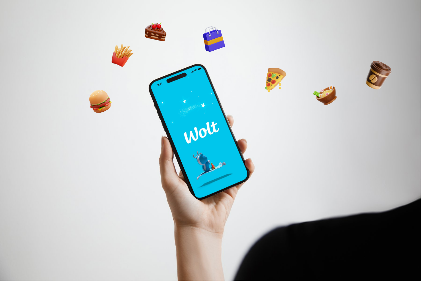
I led the redesign of a legacy hybrid mobile app as it transitioned to native iOS and Android, aligning Product, Engineering, user needs, business goals, and technical feasibility into a more focused product direction.
The product sat within a broader ESM suite as the mobile self-service counterpart to an existing web application, which meant mobile needed to deliver the right self-service value rather than simply replicate desktop.
Replatforming the app from hybrid to native created a strategic opportunity to do more than modernise the technology, allowing me to use customer insight, support signals, and delivery realities to shape a more valuable and sustainable mobile product.
This mobile app was part of a bigger ESM suite. The features in it were there to support parity with its desktop counterpart.
Built using a hybrid framework, it had initially enabled faster development, but over time introduced limitations in performance, platform alignment, and maintainability. At the same time it had not evolved meaningfully to reflect how users actually needed to use mobile self-service.
The result was an application that was both technically constrained and product-wise outdated.
This created a dual problem:
- A technology foundation that could not support future growth
- A mobile experience that did not fully meet user needs or business expectations
The beginning
The app rebuild started under clear constraints: budget, team size, scope, and timeline. As a result, the initial direction was to recreate the existing app on a new technical foundation, with a strong focus on desktop parity. Feature priorities were largely shaped by the team’s familiarity with the desktop product and the wider suite.
A designer had already been assigned to produce screens based on the existing functionality and visual language of both the app and its desktop counterpart.
Where I stepped in
Despite the constraints, I saw an opportunity to use the rebuild for more than technical modernisation. It could also improve the product’s flow, usability, adoption, and overall value.
Several issues stood out:
- The app was supporting desktop-defined goals rather than mobile-first ones, with success largely framed around parity
- Prioritisation was heavily driven by development effort and heuristics, shaped by the desktop self-service solution
- There were no meaningful product metrics in place to track usage, retention, adoption, or satisfaction, beyond occasional support tickets, which were themselves limited due to low app usage
There was also room to strengthen the wider workflow:
- The mobile team’s design maturity still had room to grow
- Stakeholders were regularly requesting new features, but without the data needed to validate or prioritise them with confidence
- Product discussions were mainly driven by Product Management and Development, and despite the fact they were both very experienced, knowledgeable and capable individuals, with design not yet fully involved in decision-making, there was a side missing in the conversation. This created room for misprioritisation and decisions backed only by dev effort and backlog priority
Opportunities identified
I saw the rebuild as a chance not only to modernise the technology, but to:
- Define a clear and valuable role for mobile self-service
- Improve task efficiency and usability in mobile contexts
- Align user needs, business goals, and technical feasibility
- Establish guardrails for consistent decision-making
- Introduce measurement to support ongoing product improvement
Creating alignment
This is where my technical background became especially valuable, in combination with my Product Design expertise
- I asked to be involved in feature prioritisation and backlog discussions, which allowed me to help bridge Product and Development. I could translate between both perspectives, surface hidden constraints, and keep conversations grounded in a shared understanding of what was useful, feasible, and worth pursuing.
- I also introduced regular design reviews with Product Management and Development, helping the team identify risks earlier, challenge assumptions, and make more informed decisions within scope.
- Alongside this, I worked closely with the Product Manager during customer interviews and calls to better understand pain points, uncover mobile-first needs, and bring user insight more directly into product discussions.
- I also established a design system where none previously existed, introducing consistency, intentionality behind design decisions, and a framework grounded in both technical constraints and business trade-offs.
- Brought a clear accessibility standards framework into the development process
By bringing design in as an active voice alongside Product and Development, I helped widen the conversation beyond delivery alone and toward user experience, business value, and longer-term product direction.
This alignment helped create the foundation for a stronger product than the one it replaced.
Challenges & Constraints
Technical
- Backend dependencies limited workflow changes
- Platform-specific requirements across iOS and Android
- Need to stay aligned with system logic and integrations
Product
- Desktop expectations shaped the baseline
- Mobile still needed meaningful product value
- Complexity had to be translated selectively
Business
- Adoption and engagement needed to improve
- The rebuild still had to show value
- Product visibility remained limited
Delivery
- Timelines and scope were fixed
- Capacity and budget shaped priorities
- Ambition had to stay feasible
Discovery
Main Risk: Redesigning based on internal assumptions
To address this, I worked in close partnership with a Product Manager and a Development Lead, and treated discovery as a shared,cross-functional activity.
We joined customer conversations to build a direct, shared understanding of user reality, rather than interpreting insights separately later.
I also reviewed support tickets and available store-level product signals. This added another layer of evidence, hinting at where users were encountering friction, what issues were repeatedly surfacing, and where the app may not have been delivering enough value.
We focused on understanding:
- How mobile fits into real day-to-day workflows
- Critical tasks, when users are away from desktop
- Useful vs Unnecessary on mobile
- Points of friction in the current experience
- Opportunities for distinct value on mobile
This ensured alignment across Design, Product, and Engineering from the source, not just at decision points.
Key Insights
- Mobile is not a smaller Desktop
Mobile as a platform, supports short, context-driven interactions. This requires stronger visual prioritisation, optimised flows, and a clear, scannable structure.
- Availability did not automatically translate into business value
Although the app existed, relatively modest store performance and limited engagement signals suggested that presence alone was not enough. The product needed to be shaped not only around real user needs, but the business outcomes it was expected to support as well.
- Support demand exposed friction
Support tickets indicated users were still encountering enough friction to require help outside the product. The support ticket review, helped surface areas where the experience was unoptimised, inefficient, or not supporing the right user goals.
- Customer needs were more situational and industry dependent, than broad
Customer conversations suggested that mobile value was not about full desktop parity, but about supporting the right tasks, at the right time. Users pointed out fast access, quick capture, progress visibility and quick decisions as their main goals on mobile, rather than deep multi-step flows.
Prioritisation needed to lie at the intersection of user needs, business priorities and delivery realities
Customer input, support demand, and relatively modest store signals made it clear that the opportunity was not to broaden the app indiscriminately, but to focus on the workflows most likely to improve user value, support business outcomes, and earn their place within the realities of scope, budget, timeline, and technical effort.
Strategy & Business Alignment
We translated the insights gathered through discovery into a shared decision and prioritisation framework, used to filter features before they reached implementation.
To move forward, each feature needed to demonstrate a strong enough case across:
- user value
- impact (business, user, and technical)
- business relevance
- technical effort and feasibility
- scope fit
This gave us a clearer way to decide what was worth investing in, what needed reshaping, and what should be deferred.
Some of the features that moved forward were:
- FAQs and Knowledge Discovery
- Ticket Logging and Support
- Decisions and Authorisations, including a flow optimisation redesign
The Inevitable Trade-offs
The project required clear prioritisation across user value, business relevance, and technical feasibility. For example, a more extensive redesign of the support form into a multi-step flow could have improved structure and usability, but was ultimately deferred, because the underlying infrastructure could not support it within scope. The same happened to a number of other features, that would have weighed in on the parity between the mobile product and its desktop counterpart, optimised underlying technical issues, but did not qualify effectively with the decision framework that was established, as they did not bring enough impact and value in the business and user context. Those were not thrown away, however, they were depriorised for the sake of others that are expected to make a stronger impact for the first versions of the app.
The Result
A native mobile experience, built using native technology, designed specifically for mobile use.
The solution delivered:
- Focused workflows for key self-service tasks
- Clearer hierarchy and reduced cognitive load
- Platform-appropriate patterns for iOS and Android
- Optimised goal-completion
- A scalable foundation for future product evolution, based on an established decision framework, based on shared goals across departments
The app itself evolved from a dated extension of a desktop suite into a more intentional, mobile-first product with:
- A clear role within the product ecosystem
- Strong alignment across Product, Design, and Engineering
- A scalable and maintainable technical foundation
- A measurable path for future improvement
Measuring Success
I defined an committed to supporting a baseline measurement framework so the product could be tracked continuously over time, giving the team clearer visibility into satisfaction, adoption, engagement, retention, churn risk, and overall product health.
Note: Because the app was delivered in a B2B context and used by our customers’ own end users, deeper behavioural analytics were limited/not possible by privacy and organisational requirements. This meant measurement had to rely on higher-level product signals rather than granular user tracking.
Impact
Users
- Faster access to key self-service tasks
- Better support for mobile approvals
- Clearer progress visibility

Business
- Baseline for adoption and retention tracking
- Better visibility into product health
- Stronger focus on measurable value
Product
- Native iOS and Android foundation
- Clearer role for mobile in the ESM suite
- Shared decision framework for prioritisation
Team
- Greater design maturity through a more intentional and structured design approach
- A new design system created consistency across screens, patterns, and decisions
- Shared understanding of technical and business trade-offs earlier in the process
Reflection
Technical rebuilds are often treated as delivery work.
In reality, they are moments of leverage.
By aligning closely across Design, Product, and Engineering, grounding decisions in real context, and working within clear business and technical constraints, we were able to turn a necessary migration into a meaningful product shift.
The biggest value did not come from rebuilding the app.
It came from rethinking what the app should be.